 I haven’t done a book update in a month, mostly because I haven’t done a thing on either book. I’ve been out of town with my children, exploring the northeastern part of the country. I was able to spend some time with my dad in New York, and then I traveled to New England to catch up with some old friends and see lots of historical venues. All in all, we were gone exactly three weeks. I spent last week catching up on everything else, including my ProGen homework for the month. I wrote an 18 page evidence analysis report for my Revolutionary War ancestor Nathaniel Hobart. Yesterday, I was finally able to sit down and start working on one of the books.
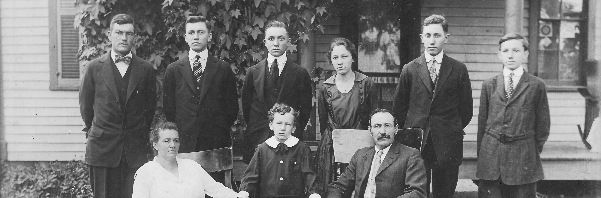
While I was out of town, some documents that I had ordered for my research on the David Jegerlehner descendant book arrived: the death certificate for George Yegerlehner and a stack of obituaries from the Allen County Public library. It appears that George died in Oak Park, Illinois while visiting (or living with) his daughter Hazel. Wilbur O. Igelman, Hazel’s husband, was the informant on the death certificate. The Igelmans were enumerated in Oak Park in 1940, and they were apparently still living there in 1949. So mystery solved as to why George died in Oak Park!
The first volume of Roscoe and Gladys’ letters now exceeds 200 pages. I am working on assembling Chapter 7, the letters from November 1942. Chapter 8 will contain December’s letters. Then the hard work of writing short biographies of select individuals shall begin. I began looking at some blog articles about type font last night. Since I am planning on self-publishing the letters, there is a lot to consider. I have been using Calibri font while assembling the letters, but most books use a serif font (vs. a sans serif font). This WordPress blog uses a sans serif font. The publishing industry has been debating font merits for readability and legibility for a very long time. Personally, I think it just depends on what your personal aesthetic is. Two of the standard recommended choices for self-publishing are Garamond and Palatino. Below are samples of these two types plus the Calibri I use for general word processing. What do you think works best?

Garamond (a serif font)
Palatino Linotype (a serif font)

Calibri (sans serif)
Link to article: Picking Fonts for Your Self Published Book
© Deborah Sweeney, 2014.
Post originally found: https://genealogylady.net/2014/07/27/the-book-progress-report-july-24-2014/
