 This week was my first full week back to work at my day job. Wow! My vacation is truly over. Late summer and early fall are my busy season. I will be madly working on state mandated testing until the end of October. Despite my schedule change, I still managed to work on the book and transcribe this week’s letters.
Last week after I decided to start using the Palamino font, I went back through the manuscript and changed both the font type and the size. The book has now increased in length and measures over 300 hundred pages. I am almost done assembling chapter 8 (November 1942). Chapter 9 will include all the letters from December 1942. I intend to write a chapter of biographies of the people who are mentioned in the 1942 letters only. The last steps will be assembling a bibliography of sources (these sources will mainly be the ones I use to write the biographies) and an index. I haven’t played too much with word’s indexing function and I am not sure how well it will work, especially since people’s names are not always complete. So I may be building an index of names from scratch.
The next thing I worked on this week was finding an appropriate symbol to separate each letter. Up until this point, I used 5 centered asterisks after each letter. Very boring! And it looked amateurish. I was thinking of finding a symbol that looked like an anchor since my grandfather was in the Navy; I wasn’t really happy with any of the choices I found. In typography, this device is known as a hedera. In old latin texts, it was used to separate paragraphs in long documents (between the chapter breaks). The device was typically shaped like a leaf from the hedera plant. I found that by playing with symbols in word, using the Wing dings font, there are some pretty great graphics that work very nicely.

My hedera symbol
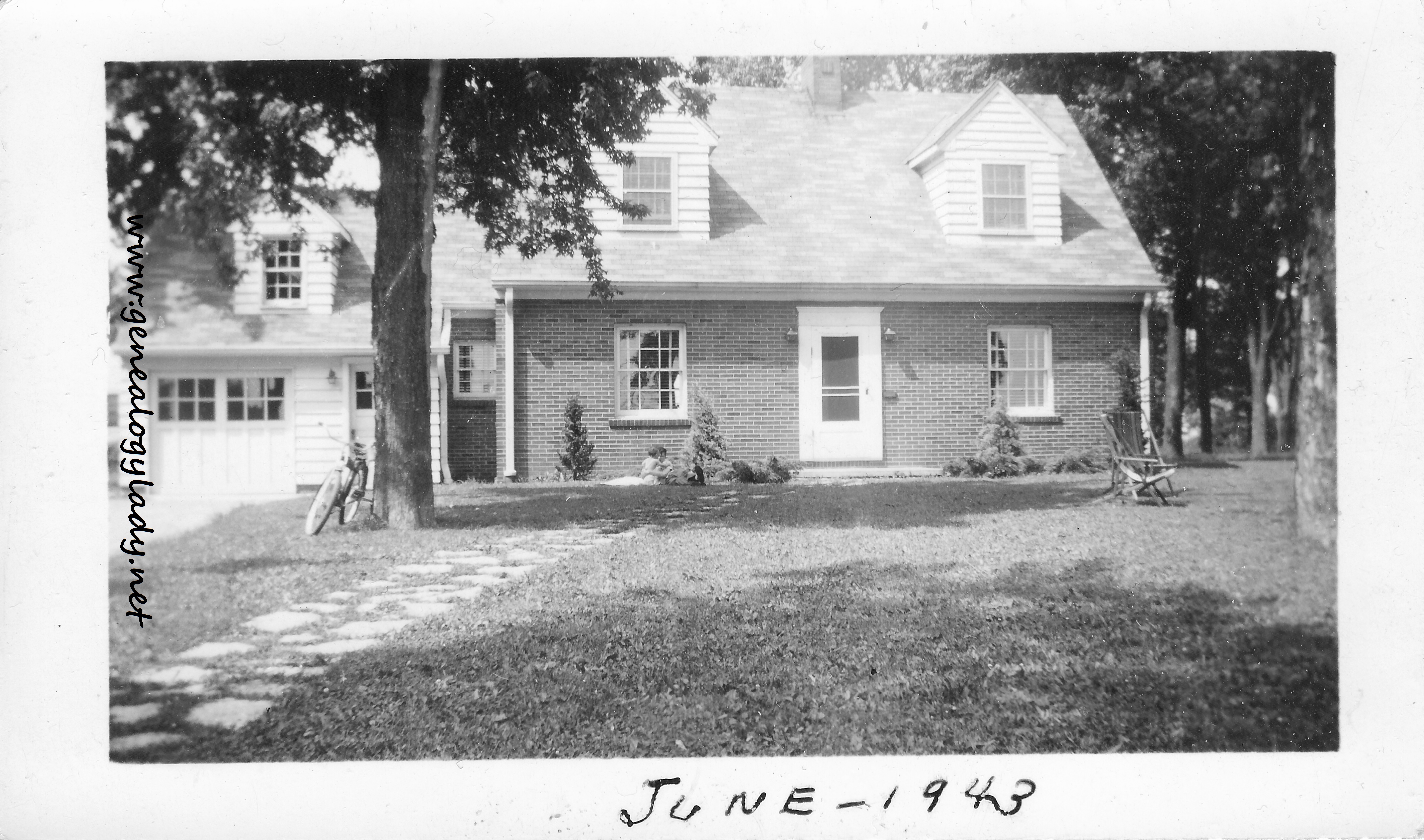
Another idea I played around with was making a simple family tree graphic. Since the letters mention family members often, I thought it would be an easy way for readers to quickly find and see the relationships. I have completed one chart for the Yegerlehner family and intend to make two more: one for the Fosters and another for the Schiele family.
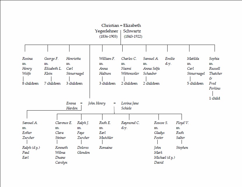
Yegerlehner family tree
My last brainstorm for the week involved the use of poetry. Often chapters in books have quotes at the beginning. Roscoe and Gladys didn’t particularly have any favorite poets BUT they did enjoy opera. Operas are mentioned often in the letters so I thought this was a good way to incorporate that love into the book. So now I am gleaning one of the family’s favorite operas to find meaningful quotes. And when I say the family, I mean my generation as well. My dad took me to my first opera when I was six and it was this opera. Until this week, I had not realized that it was my grandmother’s favorite opera as well. I won’t name the opera as I want to leave some of the book a secret.
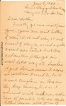
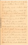
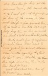
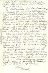
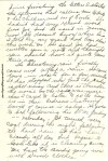
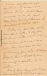
So my question for the week to my readers is…should I leave in the crossed-out errors in the letters? It looks neater if the strike-outs are removed but I think it takes away some of the personality and authenticity of the letters. What do you think?
© Deborah Sweeney, 2014.
Post originally found: https://genealogylady.net/2014/08/02/the-book-progress-report-august-2-2014/